



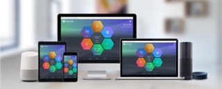
A series of visual metaphors, animations and interactions similar to those in the real world are used in the UX and UI of the app for a more natural feel while dealing with these new age IOT technologies.
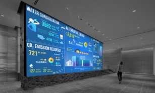
Visual design of an 18ft x 9ft video wall display for the new Intel building in Bangalore in India. The display is a dynamic infographic showing the statistics and advantages of the green initiatives of Intel, in a fun way.
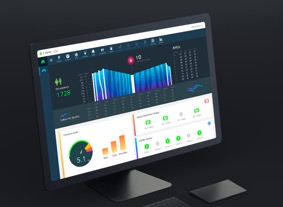
The approach to design here was to simplify the understanding of complex and large amounts of information. The overall approach for the user interface was to beautify the dull world of numbers and controls, with playful interactions and visuals.
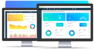
This is a cubicle and conference room booking system for Intel campus buildings. These are in the form of large touch screens in the form of kiosks on all the floors of the buildings.

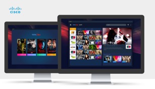
This is the proposed desktop app for Tata Sky, which opens up their libraries of content for VOD consumption, and also streams all the TV channels on desktop and mobile. Also with the new desktop app, we also designed a new version of their mobile apps on Android & iOS.
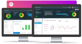
Visual design of all the dashboard screens for internal project monitoring at different executive levels for all the Motorola main offices worldwide.
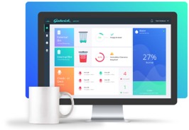
This is the design of the UX and interface for a portal to monitor and control certain IOT systems at Gatwick Airport in London.
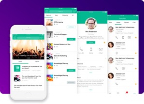
Design of the mobile app of a customisable social product for a company in the enterprise social intranet business.
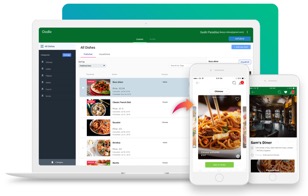
Complete design of mobile apps on iOS and Android, and a content management system for a system to order food at a restaurant table without the need of a waiter.
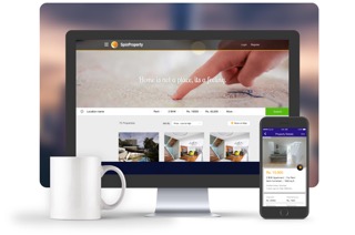
Design of mobile apps on Android & iOS, and a responsive website for a real estate company who is in the content business. The apps and web are dynamic in nature with functionalities related to buying, renting, selling and advertising real estate properties.
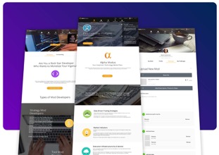
Design played an important role here in communicating the new concepts and ideas related to stock market, trading and portfolio management, by means of hand-holding the user across the site, and improving the discovery of financial products for users.
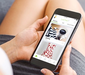
The app primarily focused on pre-owned products for the female users. A lot of the choices of visuals and interactions were modelled around women, and on glorifying the pre-owned products to improve their perception and impression.
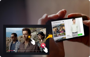
The overall design approach here was to have an optimised experience of each part in landscape mode, navigating easily through different screens of the video, products, product details, actors, cast info etc, along with maintaining a familiar and stable context for the user across these navigations.
© Copyright 2019. GrowthBeats Technologies Pvt. Ltd. All rights reserved.